Understanding Color Psychology for Improve Web Design
21 Nov 2015
Understanding Color Psychology for Improve Web Design
he way different colors influence our mood, state of soul and body is really exciting. Most of us do not realize how it works and only a few probably pay attention. Though the influence of the colors may be some what overestimated, we can obviously feel it in some situations (imagine yourself in a dark red room or in the room in the sky colors). Today we’ll be speaking about color perception and color psychology in website design, the way different brands use colors and what’s their message.
The colors are divided into two basic groups – colors in the red area of the color spectrum known as warm colors (red, orange and yellow) and colors in the blue area known as cool colors (blue, purple and green). The warm colors evoke emotions ranging from feelings of warmth, comfort and coziness (the fire burning in the rainy cold evening) to anger and aggression. Cool colors are as a rule described as calm and tranquil but can also be associated with sadness (being in blues) or indifference.
Color Tips that Will Improve Your Conversions
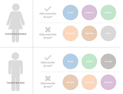
1. Women don’t like gray, orange, and brown. They like blue, purple, and green.
The sociological differences between color preferences is a whole branch of study unto itself. Patel got it right when he cited the colors preferred, and disliked, by the two genders.
In the ancient times people believed that colors can cure from different diseases. This science was called Chemotherapy, and some of the basics were as following:
- Red increases blood circulation and thus stimulates the body and mind
- Yellow stimulates the nerves and purifies the body
- Orange increases your energy
- Blue treats pain
- Indigo alleviates skin problems
Though the majority of psychologists take color therapy sceptically big brands don’t seem to agree with that. They create huge marketing campaigns based on the way we perceive the colors and make people buy. Below is the table with the colors and emotions/feelings they are widely associated with. Let’s try to analyze the websites of some world-known companies and see how they implement color techniques.
| Color | Emotions |
|---|---|
| Black | Symbol of menace or evil, popular as an indicator of power. Associated with death and mourning, unhappiness, sexuality, formality, and sophistication. |
| White | Purity or innocence. Cold, bland, and sterile. |
| Red | Evokes strong emotions, associated with love, warmth, and comfort. Still considered an intense and angry color that creates feelings of excitement, intensity, sexuality. |
| Blue | A favorite color for many people and the color most preferred by men. Gives the feelings of calmness or serenity. Described as peaceful, tranquil, secure, and orderly. |
| Green | Symbolizes nature and the natural world. Represents tranquility, good luck, health, and jealousy. Symbol of fertility, has a calming effect and relieves stress. |
| Yellow | Cheery and warm, but can also create feelings of frustration and anger. Most fatiguing to the eye (that’s why you’ll rarely see a bright yellow website or a room painted with yellow with the exception of playrooms for kids) yet most attention-getting color (so great color for important details or calls to action- remember the yellow stop/caution color). |
| Purple | Royalty and wealth, wisdom and spirituality, sex and relationships, exotic and special. |
| Brown (all of us love wooden backgrounds). | Natural color that evokes a sense of strength and reliability, warmth, comfort, and security. |
| Orange (banner color of the counter-culture). | Blatant and vulgar color, makes you feel excitement, enthusiasm, and warmth. As a combination of red and yellow it’s often used to draw attention. |
| Pink | Associated with love, romance, youth, freshness and may have a calming effect. Pink effect depends on the type of pink (strong, light, deep etc). |
What colors do you use in website design? What are your favorite colors? Waiting on your comments guys!