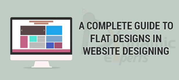
A complete guide to Flat Designs in website designing
4 Dec 2016
A complete guide to Flat Designs in website designing
Web site designing is undergoing a fast change with all the smaller digital devices like mobile phones picking up the internet. The buzz words we hear recently are ‘minimalism’ ‘responsive’ and ‘flat design’. Large companies like Microsoft started embracing flat design concepts and naturally we are going to witness everyone following the same.
Though the Flat Design has been around for many years, 2013 really is considered to be a year of flat design in the digital front. This concept is not a new one and the trend towards ‘flat’ is resurging slowly on top to stay there for many years to come.
Flat Design avoids big buttons with gradients and many other such call-to-action stuffs, based on the belief that technological literacy has improved a lot in the last few years and so the users are aware of what to do on a website.
So the fear that UX experts had before, that users might miss a button or an icon if it didn’t pop off the screen, is now changing as they start to believe that users are more matured technologically and so they just focuses on making the design an uncluttered and a non busier one. The Flat Design trend is obviously towards simplicity, minimalism and user experience.
What is Flat Design?
Previously, best web designing means bombarding the users with a stunning interface, packed with animations and flashy elements. After this web designers tried to bring real life into the screen with drop shadows and faux-realistic textures. Now is the time for ‘Flat Design’ to rule the scene.
Flat Design has within it the concepts of ‘minimalism’ and ‘responsive’ attitude. With this design, users can concentrate on the content without any distraction. The main focus of flat design is the usability. At the same time, flat design does not mean just dull, ‘content only’ design.
Features of Flat Design:
- The design is a clean one without any complexity.
- No ornamental elements to distract the readers. The key to this aspect is eliminating unnecessary components or features that don’t help to fulfill the purpose.
- Choice of colors plays a significant role in Flat Design. Lively, bright colors are used to make the appearance pleasing and sophisticated one.
- Basic design structure is based on grid pattern with block elements.
- They focus on 2D images. Intelligent usage of 2D objects giving out a 3D effect is the underlying concept.
- Liberal Usage of Icons makes the site interactive, attractive and interesting. Users can identify the content easily when they are represented with icons. In addition, they can easily understand what the message is about before even reading the content. Colorful little icons grab quick attention. Moreover, icon fonts enable easy inclusion of them in the website without any fuss.
- Well planned typography is the lime light in flat design. They are presented with clear spacing between words and lines. Font faces used are clean, neat and legible with large enough size. All the whole typography of a flat designed web site presents the readers effortless reading.
Guiding principles of Flat Design
The central idea to keep in mind while designing flat designed website is ‘simplicity’. Designers must not deviate from this central concept. They must adhere this rule to whatever feature they are implementing.
Use vivid and vibrant colors to design the site. Designers can refer the ‘Flat UI Colors’ online tool as a guide for selecting right color modes. Though bright colors are attractive, it is not a compulsory feature for flat design. Plain colors or just black and white is also enough to come out with a good flat designed website. The underlying concept is sophistication and pleasing appearance.
In good typography usage ‘sans serif’ font face ensures clear and crisp appearance. The content presented must be precise and to the point. All elements of User Interface such as links and buttons must be noticeably distinct.
When you are hearing about “flat design” for the very first time, then you will be surely impressed by it and the flat design has become a new web design trend in the recent days. The flat design is completely based upon two-dimensional aesthetic. In a flat design, the buttons will never look like a 3D made one and it will be a simple layout with some graphics added to them. The following are some of the reasons why you should use a flat design for your website.
Benefits of a Flat Design
Flat designed websites can load faster when compared to the ones that have complex graphics and animations on them. The flat designed websites can easily adjust to the screen sizes in which the website loads with. As the mobile device usage has been increased in the recent years, the flat design is the best way to insert many web browsing tools in your website, so that your visitors can make your them by browsing your website through their mobile phones. The flat design is a user-friendly one and it can be easily designed.
How to make use of flat design in your Web Page
Using a flat design in your webpage can make your visitors feel comfortable while browsing through your web page. The following are some of the things that you must do while making use of a flat design for your website.
#1. Choose a simple background
Never use a loud image or the brick-wall patterns for your website. Make use of a plain background with smooth colors on them. The color palette should be a subtle one so that your visitors can stay on your website. The color palette should not disturb the human eyes.
#2. Say no to effects
Never make any kind of bevels, gradients and animated transitions in your website. A flat design will never have such effects on it. Flat design portrays the depth and a live emotion towards your website.
#3. Take out the icons
A flat designed website would have icons that provide a streamlined user experience to the visitors. Make sure to design your icons simple and clear so that it can be easily noticed without adding any kind of effects to them.
#4. Play with the shapes
Squares, circles and lines are the most used shapes in a flat designed website. Create a clear vision of your content and make them visible by dividing your flat design with the common shapes.
#5. Go for the bright colors
The color palette of a flat design must be a fresh, cheerful and a light one. Make use of bright pinks, greens, blues and yellow colors. These colors can easily attract a human eye and it can make the visitors to stay on your web page and read all your contents.
#6. Create the basic navigating methods
The navigation menus and all the links on your website must be simple. Remove all the effects on the navigation menu so that you can view only the navigation menu with text on them. Make use of simple boxes to create a navigation menu. Never create any kind of shadows or highlights on the navigation menus on your website.
Design principles have witnessed a shift from the skeumorphic designs of textures and drop shadows and have moved towards more simplistic and aesthetic appearance. Known as Flat design in the everyday Design parlance, this is the new trend which is gradually gaining ground. Let us take a look at the principles and best practices that govern Flat Designs.
Defining Flat Designs
Open, clear, crisp and compact are some of the attributes that can be assigned to flat designs. It focuses on usability without compromising on aesthetics. Though without any frills and fancies, Flat designs, are nevertheless, appealing to the eye and easily comprehensible to the mind. They use bright colors to compensate for the bevels and drop shadows, and are two dimensional in nature.