10 Responsive Web Design Tips to Make Your Site Mobile Friendly

1 Oct 2017
10 Responsive Web Design Tips to Make Your Site Mobile Friendly
In this digital era, you cannot ignore the fact that many people are visiting your website on their tablets and smartphones. If your website is not responsive or mobile friendly by now, chances are you are losing a large number of visitors. Therefore, it is always a good idea to embrace responsive design. Since I have the experience of designing many responsive websites, I would like to share ten useful tips to design excellent responsive websites.
1.Start With a Mobile First Approach
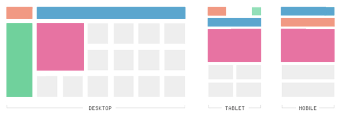
You should build the mobile site first, and then scale up and build the tablet and desktop designs of the website. One of the major concerns for all three (mobile, tablet and desktop) is the logo and/or text. If the text is easy to read on the mobile device, then you should not have any issues with the desktop or tablet.
2.Make Proper Planning of Content
Content planning is always the top priority for designing responsive website. Building a responsive web design is the perfect time to make the website content more readable and accessible, regardless of what device it is being viewed on. You should map out the order that the content of website should appear on each page at the smallest browser width.
3.Build the Layout of Your Site First
I recommend you to build the entire layout of the interface before doing coding. In this way, you will have the website-look that your client wants. While building a mobile site layout, one important consideration is to make the buttons large enough for a fingertip. Another consideration is to keep the website design simple and functional. I’ve seen many designers to add too much to a mobile interface, but it is not required as it can cause many design and usability problems.
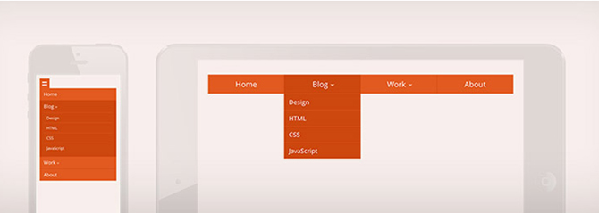
4.Say ‘NO’ to Navigation Menus
As responsive websites target smaller screens (smartphones or tablets), it is always recommended to hide the main navigation menu. In its place, you can choose combining an icon and text for indicating the user about the menu. You can either include a simple drop-down menu which slides down or an overlay technique where the menu expands and covers the entire screen. If your website contains only 2-3 navigational menus, you can include these in a simple menu on the screen. If there are more than 3 elements, you can consider creating a single icon that opens into a drop down menu.
5.Try to Use Many Software Programs
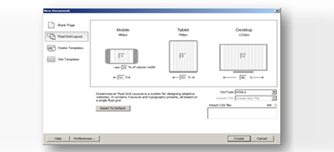
For building a complex web design, you should use custom programs and code for each site individually. Using a template with WordPress will not be enough for building complex web design. For example, if your layout is fairly straightforward you can use a template such as ‘Moboom’, but for a complex layout you should use programs such as a standalone program such as GoMobi for the mobile layout and Adobe Dreamweaver for the desktop.
6.Breakpoints
A common designing idea is that breakpoints should be based on common screen sizes (tablet, mobile, and desktop). However, by developing for specific device resolutions, we are not fully accepting the potential of responsive design, which is centered on flexibility, fluidity, and adaptability. It is a good idea to take a device agnostic approach and set breakpoints according to the content of site. You should explore your design so as to find the points where it naturally breaks down.
7.Create Optimized Images
For building responsive design layouts, you should create optimized images for each layout. In this way, you can reduce bandwidth and scaling issues. Try to use GIF, JPEG, and PNG-8 file formats. You should never use PNG, as it can bloat your files sizes by 5 to 10 times.
You should try to use exact measurements with images (i.e. 500x350px at 100ppi) and set image dimensions to match. It will eliminate scaling and will also preserve the quality and resolution of website images. If your images scale this could cause resolution and color depth and problems.
8.The Need for Speed
Slow loading time is one of the drawbacks of responsive web design. A recent study shows that the 48% of responsive websites load anywhere from 4-8 seconds. This length of loading time was acceptable in 1997, but in 2015, 64% of smartphone users expect a website to load in under 4 seconds.
One of the main reasons behind a slow website is non-optimized images. You should quickly scale down hefty images with efficient tools like TinyPNG and Adaptive Images. In addition to this, you should get rid of excessive elements, not only for to enhance user experience, but also for site’s speed. Too many elements weigh down website and make your website unpleasant to look at. For this matter, you can use program for compression like GZIP.
9.Make it Readable
Do not make the readers pinch-to-zoom or squint to read, therefore, make the text size large enough to read from a smaller screen. A text size of 16 px, 1 em, or 12 pt is recommended. For designing headlines, you can use a tool like FitText to create responsive text.
10.Design for Screen Orientation
According to statistics, landscape orientation is used by 59% people whereas portrait orientation is used by 41% people. You should design your website to look good on both of these orientations, but pay more attention to landscape orientation. You should make sure that your images are not stretched in this orientation.
Wrapping Up
Responsive design of website makes it easier for all the users to view your site no matter what device they use. Creating enticing responsive web designs requires an extensive amount of efforts and time. If you use above ten easy-to-follow techniques for creating responsive web designs, I am sure you can easily make a perfect responsive website. If you know some other best practices that websites should follow, you can share with us in the comment box.